Information Architecture
Interaction Design
Prototyping
Research Synthesis ·
Accessibility
Content Structuring
Responsibilities:
Role: Product Designer
Duration: November 2023- July 2025
Team: Product Owner, 4 Product Designers, Development Team, Government Stakeholders
Client: U.S. Department of State Bureau of Consular Affairs
Areas: International Travel, Passports, Visas
Project Context:
Travel.State.Gov supports people navigating often time-sensitive situations—from getting a passport before an upcoming trip to understanding international travel requirements or determining which U.S. visa applies to their circumstances. Across the site, complex policy requirements and dense content made critical information difficult to find, understand, and act on.
Travelers had access to critical information—but understanding what applied to them wasn't always easy.
THE CHALLENGE
International Travel
Travel guidance was spread across a large volume of destination-specific content, requiring users to navigate dense pages to identify the requirements, safety information, and resources relevant to their trip.
Passports
Passport requirements varied based on factors like travel timing, application status, and service needs, making it difficult for users to determine which process applied to their situation and what to do next.
Visas
Complex visa types, eligibility requirements, and unfamiliar terminology made it difficult for users to determine which pathway applied to their reason for travel and to understand where to begin.
We shifted Travel.State.Gov toward a more task-oriented experience, organizing information around what travelers were trying to accomplish rather than expecting them to navigate internal government structures or interpret dense policy content on their own.
A clearer, more consistent experience designed to help travelers find relevant information and understand their next steps.
THE SOLUTION
Designing around user goals, not government structure
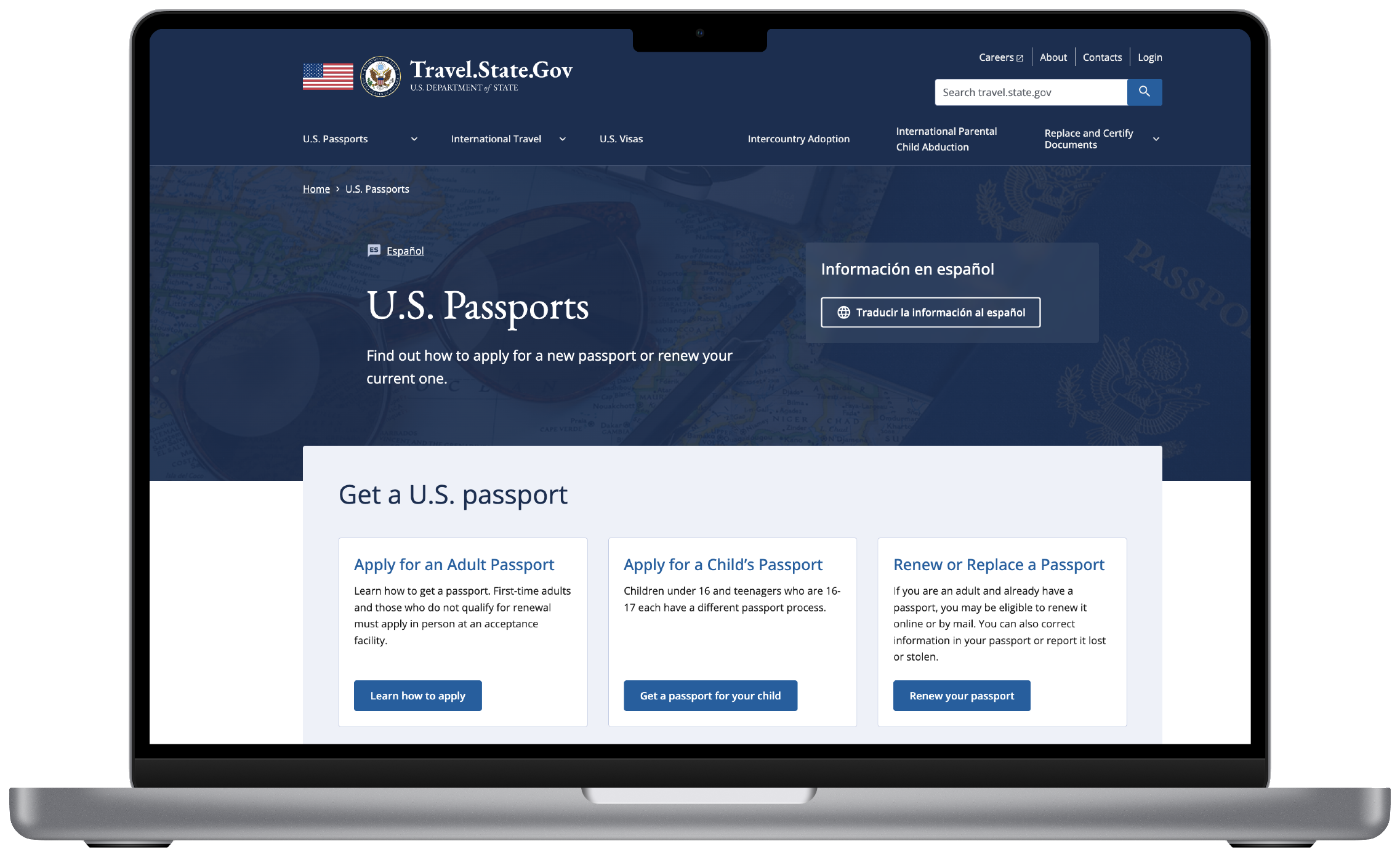
My most substantial work focused on the Passports section, where users often arrived with a very specific question:
Simplifying some of the site's most task-driven experiences.
PASSPORTS: OVERVIEW
I worked on several key passport experiences, including Get My Passport Fast, Make an Appointment, Refund, and Courier Services.
The challenge wasn't simply presenting information. These experiences were governed by detailed policies and conditional requirements, meaning the design needed to help users understand which path applied to their specific situation.
Our team inherited a sitemap from an earlier phase of the redesign, but after auditing it, we identified opportunities to better organize information around the tasks users were trying to complete.
We explored alternative structures and used tree testing and stakeholder feedback to evaluate where users expected information to live. Those findings informed a revised sitemap that became the foundation for the Passports redesign.
Before redesigning individual pages, we needed to rethink how passport information was organized.
PASSPORTS: INFORMATION ARCHITECTURE

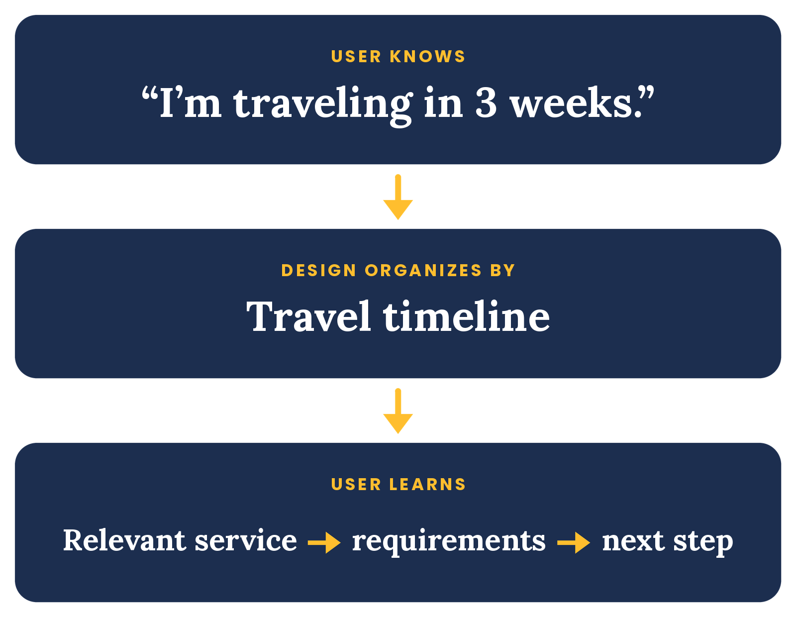
The “Get Your Passport Fast” section helps travelers determine which passport service may apply based on their travel timeline. Different timelines and circumstances can lead to different requirements, service options, and next steps.
Helping travelers understand their options based on how soon they needed to travel.
PASSPORTS: GET YOUR PASSPORT FAST
The existing experience required users to interpret service categories to determine which option applied to them, such as:
Urgent
Expedited
Routine
Life-or-Death Emergency
Rather than asking users to begin with passport service terminology, I reframed the experience around a question they could answer immediately:
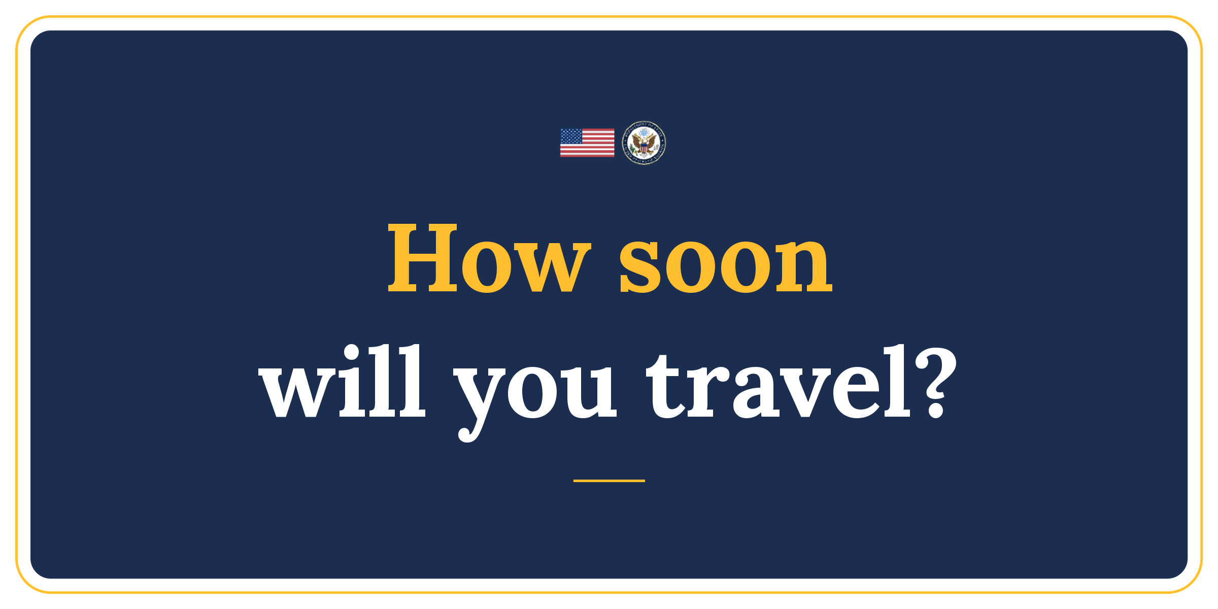
I organized information around clear travel windows, allowing users to identify their situation first and then understand the relevant service, requirements, and next steps.
The existing experience contained the information travelers needed, but important guidance was spread across introductory content, accordions, FAQs, and supporting information. Users had to scan across the page to understand whether they qualified, which scenario applied to them, and what to do next.
Making a complex appointment process easier to navigate.
PASSPORTS: MAKE AN APPOINTMENT
Our redesign preserved the underlying appointment process while making that guidance easier to navigate. We surfaced eligibility information earlier, clarified paths for users who had or hadn't already applied, and broke supporting information into smaller, more scannable sections:

The existing experience presented eligibility requirements, submission instructions, exceptions, and the refund form together on a dense page. Users had to interpret whether they qualified, determine what information they needed, and understand what would happen after submitting—all before completing the request.
The Refund of Expedited Passport Fee page helps eligible travelers request a refund when expedited service was not provided within the expected timeframe.
PASSPORTS: REFUND OF EXPEDITED PASSPORT FEE
I reorganized the information into four clear steps:

This created a more guided experience, helping users understand the requirements before reaching the form and setting clearer expectations about what happens after submission. Secondary options, such as submitting a request by mail, remained available without competing with the primary online flow.
PASSPORTS: COURIER SERVICES
Helping travelers decide whether a private courier is right for them.
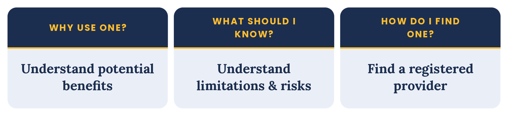
Passport couriers are private companies that can help submit applications or pick up completed passports, but they are not part of the U.S. government and do not make passport processing faster. Travelers therefore needed to understand both the potential convenience and the limitations before choosing one.
I reorganized the experience around that decision. The redesigned page introduced courier services in plain language, then grouped guidance into clearer questions: why someone might use a courier, important limitations to understand, and how to find a trusted provider. The full courier list was moved to a separate linked page so users could first understand the service before browsing providers.
The existing experience presented users with a dense list of rules and warnings upfront, followed by a registered courier list and several FAQs. While the necessary information was available, users had to interpret those details before answering a more fundamental question: Does using a courier make sense for me?
Critical warnings remained prominent, while FAQs and disclaimers were integrated into the broader content hierarchy to make the page easier to scan.
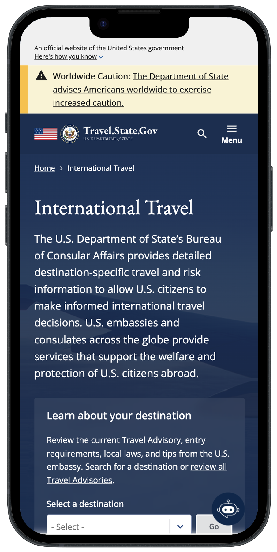
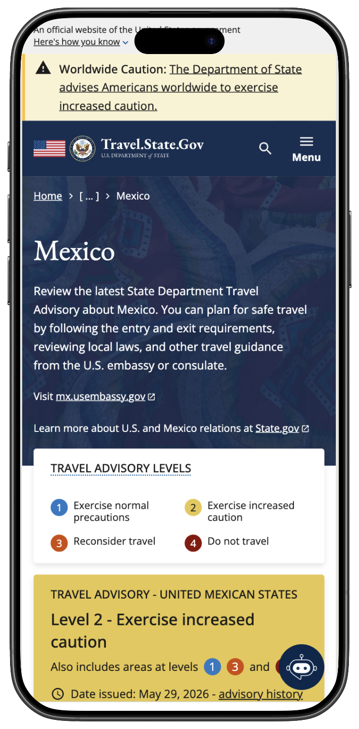
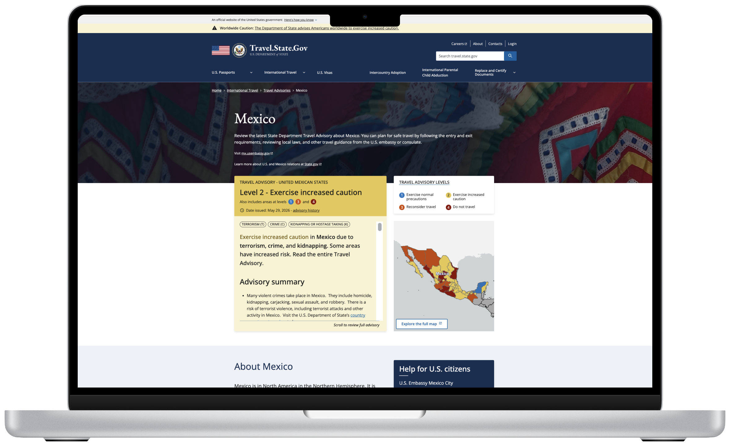
The problem: International Travel contained a large volume of destination-specific guidance, requiring travelers to navigate dense information to find requirements, safety information, and resources relevant to their trip.
Making destination-specific travel information easier to navigate.
INTERNATIONAL TRAVEL
What we did: We restructured content around travelers' needs, introduced clearer hierarchy and reusable patterns, and made important destination information easier to identify and scan across devices.
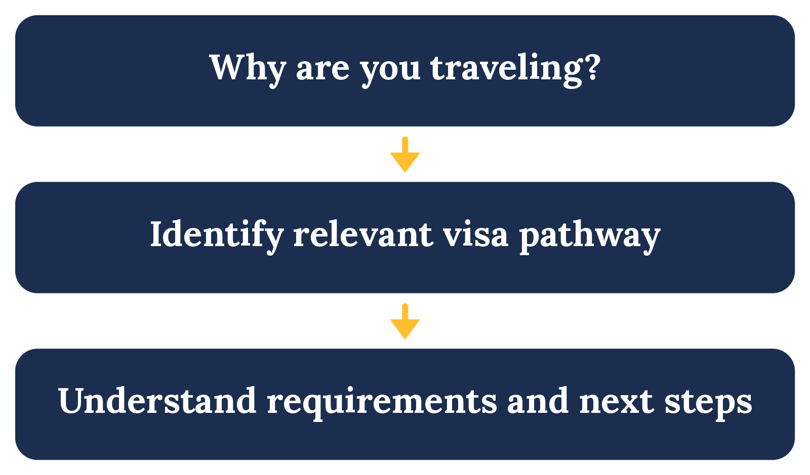
What we explored: Through research synthesis, user scenarios, and usability testing, we explored ways to organize visa information around user goals and help travelers identify the appropriate pathway before navigating detailed requirements.
The problem: Users had to navigate unfamiliar visa categories, eligibility requirements, and terminology before they could determine which information applied to their reason for travel.
Helping travelers understand where to begin in a complex visa system.
VISAS
This work remained exploratory and was not implemented before my team transitioned off the project.
RESULTS
The redesigned Travel.State.Gov experience is now serving millions of travelers, with International Travel launching in 2025 and Passports following in 2026.
The redesign introduced a clearer, more user-centered foundation for a site that supports approximately 35 million customers annually, helping travelers more easily navigate critical information and understand what to do next.
Launching the redesign.
CHALLENGES & LEARNINGS:
Designing for scale. I learned to think beyond individual pages and consider how design decisions could become reusable patterns across a much larger experience.
Adapting to shifting priorities. Team changes, launch deadlines, and evolving priorities required me to move between workstreams while keeping broader product goals in view.
Making complexity understandable. Working across disciplines reinforced that simplifying complex services isn't always about removing information—it's about giving users the right information at the right moment.